Learn it once: a tour of the endue console and why its layout stays put
A tour of the endue console, from the home board to approval cards, the Studio canvas and Spaces. Why the interface of an agent product is a control surface, how many minutes a fixed layout saves, and how often other AI apps rearranged their screens over the last four months, with dates.
On this page
If you use AI tools every day, you know the morning. The button you pressed yesterday is somewhere else. The model has a new name. The conversation list is grouped a different way. The work is the same, and a few minutes go into relearning the screen. Those minutes add up.
endue treats that cost as a design constraint. We fix the layout once, and after that we change what sits in each place, never the place itself. This post walks through the whole console and shows where each screen lives. It explains why the interface of an agent product is a control surface, and it works out, with stated assumptions, how many minutes a fixed layout saves per day. At the end it checks, with dates, how the screens of other AI apps changed over the last four months, and lists what endue has wired into its code to keep its layout where it is.
A tour of the console
The left rail and the top bar
Every screen in the console shares one skeleton. The left rail holds, top to bottom: search, outputs, the skills, connectors and devices group, your agents, new agent, new space. On the home screen, in a conversation, inside Studio, these six slots do not move. Agents stack vertically like a roster and fold behind “more” when there are many.
Inside an agent, a two-way toggle appears at the top center: Live and Studio. The left side is where you give the agent work and watch it. The right side is where you build and change the agent. Those are the only two things a person does with an agent, so there are only two positions.
Home is a board
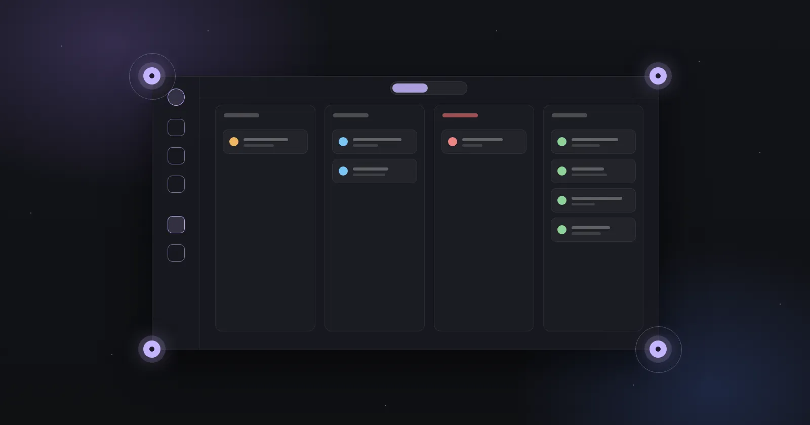
The home screen is a board with four columns: waiting for input, active, failed, done. Every run from every agent lands in one of the four.
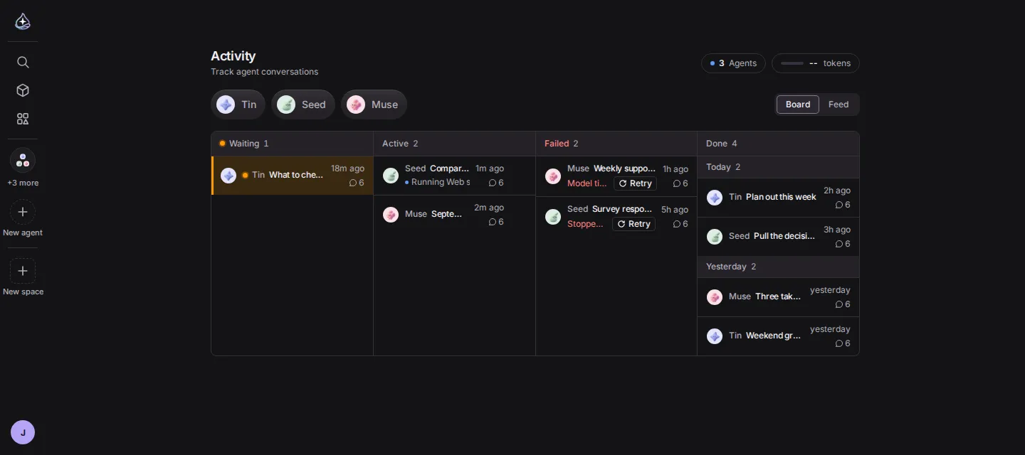
The screen does one job. When you open it in the morning, it shows what finished overnight and where things got stuck, in one look. Stuck work is in the two left columns; finished work piles up on the right. A failed run has its Retry button on the card, so you do not open the conversation. If a connected service drops, a one-line banner appears above the board and you reconnect from there.
The conversation screen
An agent’s Live screen has three parts. A sub-sidebar on the left holds projects, folders, routines and recent conversations. The conversation flows in the middle. The composer sits at the bottom.
When the agent calls a tool during a conversation, each call is one line: which service, which function, which arguments. The results follow underneath.
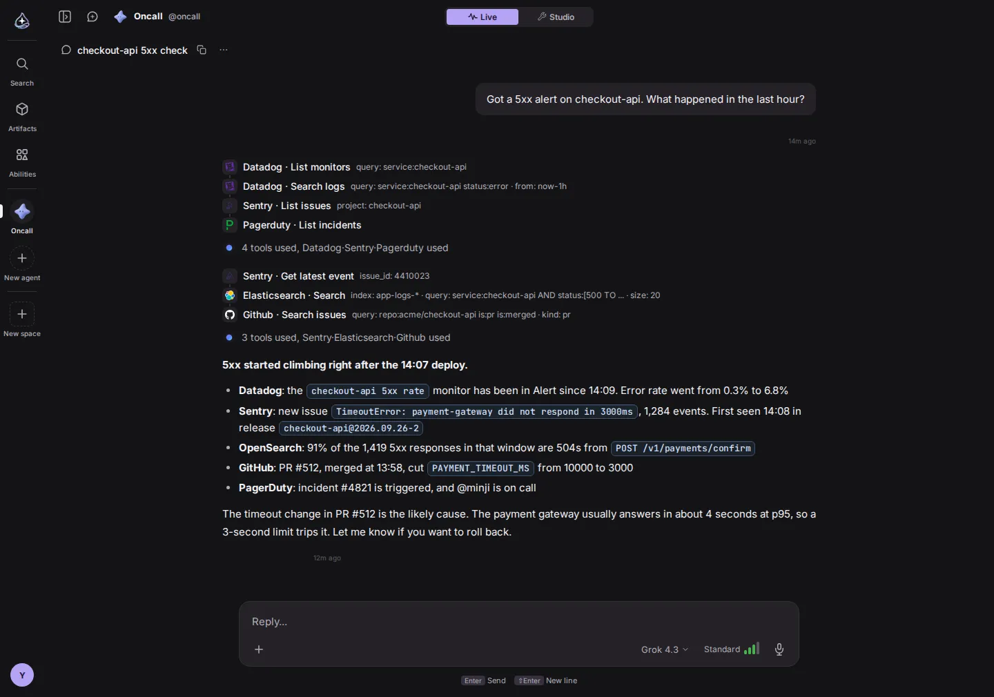
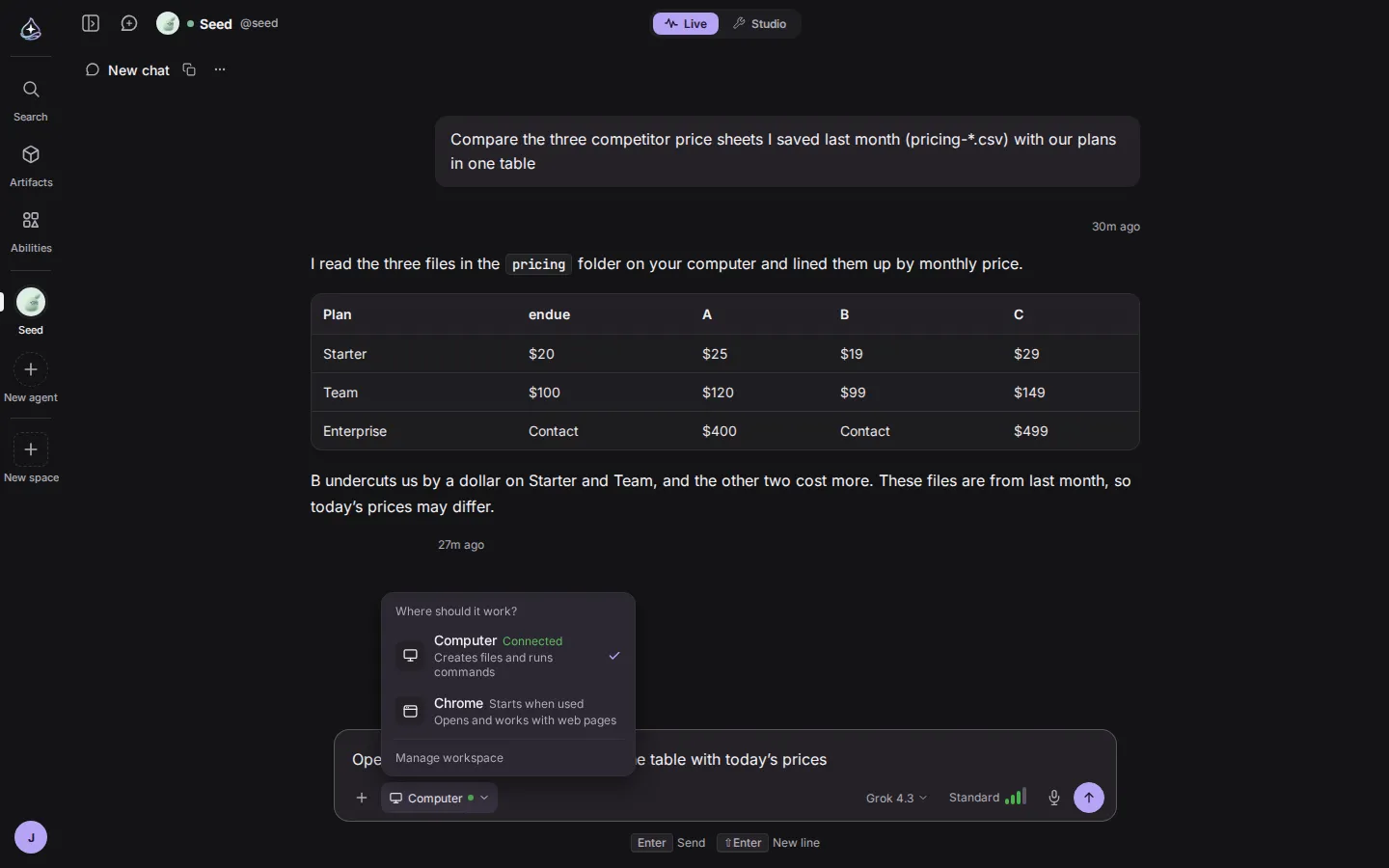
Under the composer there are four controls: attach, work device, model, effort level. A voice button sits at the far right. These positions are the same in every conversation with every agent. Open the work device control and you see whether this agent’s Computer and Chrome are connected right now or start when used.
The three shapes of a stop
A run in endue stops for exactly three reasons: it needs information only you have, it is about to do something that cannot be undone, or it needs a capability it does not have. The how it works page covers the loop in detail. What matters here is that each reason shows up as a different card in the conversation: a question card, an approval card, a request card. You know the kind before you read it.
Take the approval card.
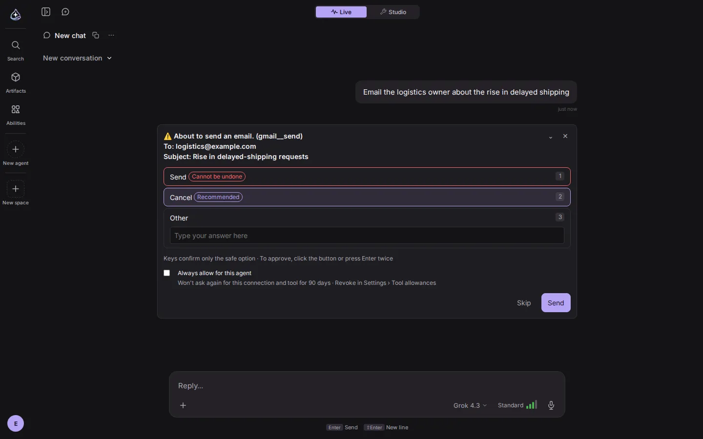
The card states the action and its arguments first. Send is marked “irreversible”, Cancel is marked “recommended”. From the keyboard, only Cancel confirms directly; approving takes Enter twice. A checkbox on the card lets you skip the question for the same connection and tool for 90 days. This gate cannot be switched off in settings. Sending mail, posting messages, deleting data: anything that leaves your account or destroys something passes through here.
Studio: one agent, one map
Switch to Studio and you get a map in three columns: where requests come in, the agent, the tools it works with. Channels, Live and API sit on the left. The agent card sits in the middle. Connectors sit on the right. Lines join them, so you read how a request enters, what it passes through and where it goes, left to right.
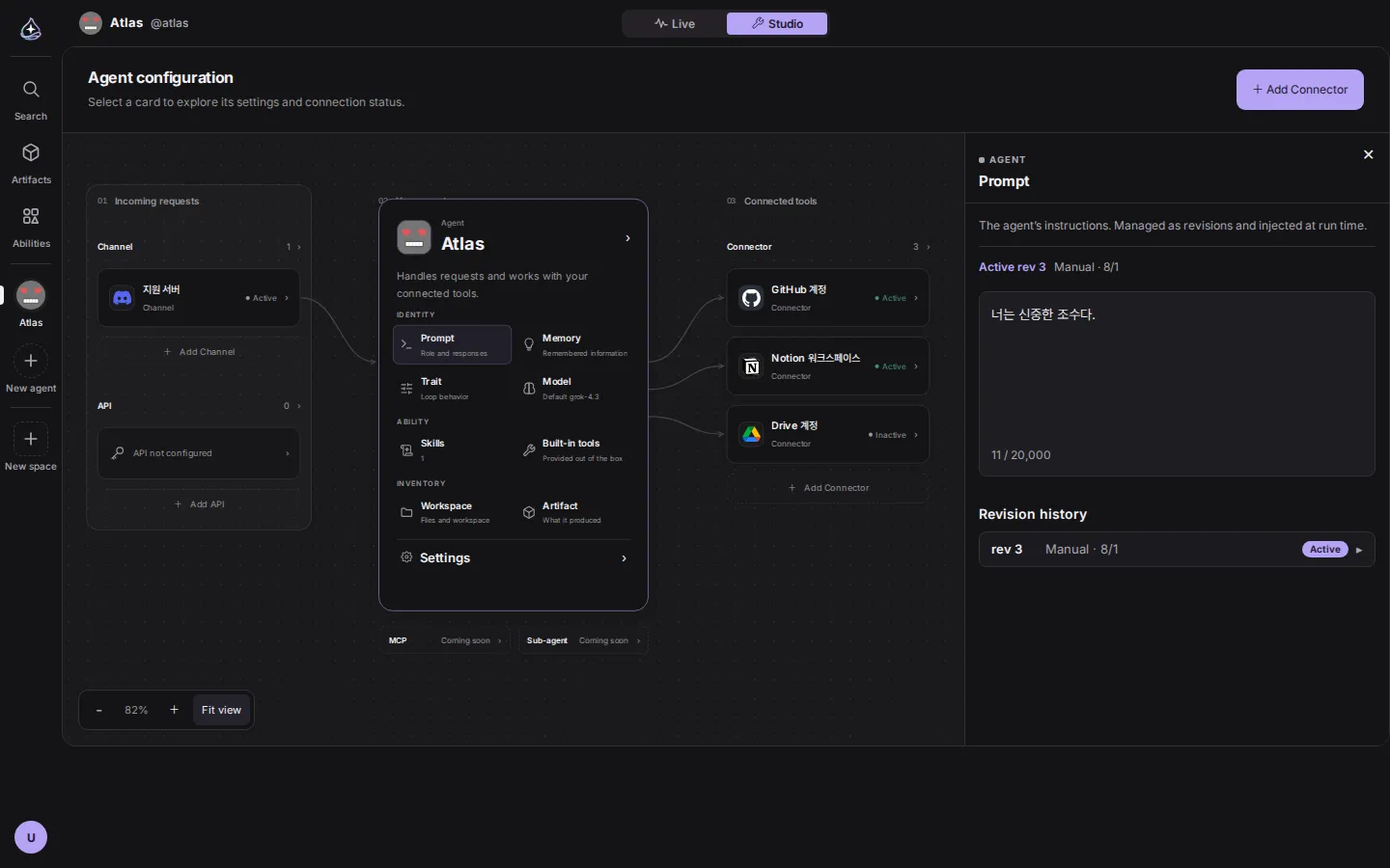
The center card has three groups. Identity holds the prompt, memory, traits and model. Ability holds skills and built-in tools. Inventory holds the workspace and outputs. Click any of them and a panel opens on the right while the canvas stays where it is. Prompts are managed as revisions: you see what changed, and if a change made things worse you go back to the previous one.
As settings grow, the map still has three columns. A new way in adds a card to the left column. A new tool adds a card to the right.
Spaces, outputs and the palette
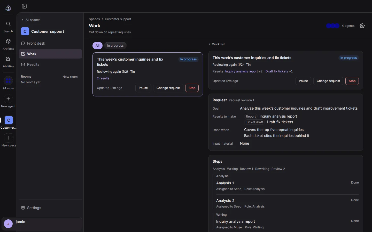
A Space is where you hand work to several agents and keep the results in one place. Each work item carries a goal, the results to produce and the completion criteria, and the steps record which agent took each one and which version of the result came out.
The outputs page gathers the files and apps your agents produced. The filters are all, chats, projects, apps, other and pinned, so you filter by where something came from.
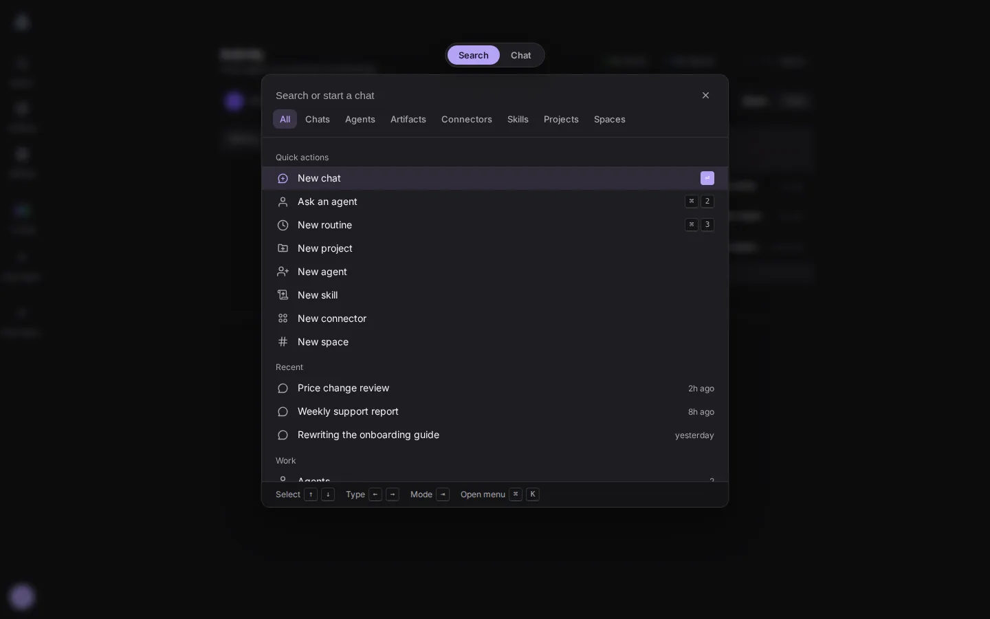
From anywhere, you can open the search palette. It has a search mode and a chat mode, and results are typed: chats, agents, outputs, connectors, skills, projects, spaces.
Beyond these, the usage screen shows token and resource consumption in four tabs (overview, models, agents, compute), and the What’s new screen lists changes to the console by date.
Same words, different devices
The names used in the console are the names used in the docs. The core concepts page explains agent, conversation, run, tool, skill, connector, memory, artifact, routine and approval, and those words are the rail slots, the palette tabs and the canvas cards. What you learn on the web carries over to desktop, mobile and the CLI. The surfaces page says which device suits which job.
In an agent product, the interface is a control surface
A chat app can get by with a text box and a reply. A person is sitting in front of it, asking one thing at a time. Agents are different. Work keeps running on the server after you close the tab. Several agents run at once. They ask for decisions while you are away.
So the job of an agent product’s interface narrows to three things. Show what is happening right now. Make the reason for a stop recognizable before you read it. Take a person’s decision accurately when an action cannot be undone. The board and the tool-call lines do the first. The three kinds of card do the second. The button layout and keyboard rules of the approval card do the third.
All three get slower when the layout moves, and slower means wrong. In a product where the approve button moves every month, people read the button and then press it. In a product where it stays, they see it and press it. In front of an irreversible action, that difference is a matter of speed and a matter of safety.
How many minutes it saves
We worked out two cases. Every number is an assumption, and the assumptions are in the tables. Put your own team’s numbers in and run it again.
The daily check
Assume five agents leaving twenty runs a day.
| Opening conversations one by one | Reading the board | |
|---|---|---|
| Time per run | 15 seconds (open, scroll to the end, judge the state) | all on one screen |
| Per day | 20 runs × 15 seconds = 5 minutes | about 30 seconds |
| Per month (22 days) | 110 minutes | 11 minutes |
The difference is about an hour and forty minutes a month. The time spent finding a failed run inside a conversation and resending it is not counted. On the board, Retry is on the card.
Relearning when the layout moves
Assume one change that moves things around on screen.
| Assumption | |
|---|---|
| One user finding the new places and rechecking defaults | 10 minutes |
| Updating the team guide and its screenshots | 30 minutes |
| A team of 10, one such change per quarter | (10 minutes × 10 people + 30 minutes) × 4 = about 8.7 hours a year |
| No layout changes | 0 |
One cost is missing from this table: an approval pressed by mistake in a place that moved. It cannot be written in minutes, so it is left out.
What the learning curve says
Research backs this up. In The Power Law of Learning (2016), Raluca Budiu of Nielsen Norman Group describes how the time to complete a task falls with repetition along a power curve and then flattens. In a menu study she cites, one design reached that plateau after four repetitions while another needed ten or eleven. Her conclusion: a new design has to compete with an old one that is already well practiced, and users often leave before the new design’s advantages show.
In the CHI 2013 case study Minimizing Change Aversion for the Google Drive Launch, Aaron Sedley and Hendrik Müller of Google define change aversion as “a state of discomfort and anxiety when something familiar is replaced with something unfamiliar”. Familiar designs, they write, keep an edge over new approaches until the new version has been used enough. Their ten recommended actions include letting users switch between the old and new interface and telling users what was improved.
There is a large-scale example too. In 2018, a petition to undo Snapchat’s redesign drew 1.2 million signatures, and daily active users fell that second quarter from 191 million to 188 million. It was the first decline in the company’s history, and the CEO pointed to the disruption caused by the redesign.
What changed in four months
We checked how often AI apps rearrange their screens, using each company’s own release notes and what users wrote. Dates are local.
| Product | Date | What changed | Source |
|---|---|---|---|
| ChatGPT | August 2025 | The model picker disappeared with the GPT-5 launch and came back days later | TechCrunch |
| ChatGPT | June 10, 2026 | The model picker was relabeled: Thinking Standard became Medium, Extended became High, Heavy became Extra High, and Light was removed | Release notes |
| ChatGPT | June 18, 2026 | How chats and projects are pinned in the sidebar, and how Recents are grouped, changed | Release notes |
| ChatGPT | July 16, 2026 | The desktop app changed how you choose between Chat and Work and find conversations and Projects | Release notes |
| ChatGPT | August 21, 2026 | The sidebar changed to show up to eight recent conversations | Release notes |
| ChatGPT | September 14, 2026 | Automatic switching from Instant to Thinking was retired | Release notes |
| ChatGPT | September 23 and 25, 2026 | After the sidebar and projects layout changed, users described what the new places broke and asked for an option to keep the previous interface | Community 1 · Community 2 |
| Gemini | May 2026 | The Neural Expressive redesign. Tools and attachments merged into one + menu; the account and settings menu moved into the sidebar | Android Authority |
| Microsoft 365 Copilot | May 28, 2026 | A new design. The left navigation now expands and contracts, and the prompt area changed | Microsoft blog |
| Microsoft Copilot app | September 2026 | A rebuild around three tabs, Home, Code and Autopilot. Microsoft called it “the biggest redesign yet” | Fortune · AlternativeTo |
These companies have reasons. New models and features arrive every few weeks, and the screen has to hold them. endue adds features too. The difference is where a change lands. Changing the names and number of options costs the user one thing; moving the place the options live costs another. Every change in the table that drew user posts is in the second group.
What we wired into the code
“We will not move things” is a promise that intent alone does not keep. The endue console carries a few mechanisms in its code.
- Role tokens. Colors are used only by role names such as background, card, danger, success. Light and dark values are defined together, and the contrast between text and surface is computed automatically against a 4.5:1 threshold. A shortfall fails the check.
- Shared parts. About sixty parts, including buttons, inputs, tabs, menus, badges and cards, form one kit, and screens are assembled from it. Buttons come in four heights (28, 32, 40, 48) and corners in four radii (4, 8, 12, 16). A new screen cannot bring a new shape with it.
- Style rules. Raw colors, arbitrary font sizes and unnamed z-layers are rejected by lint. One violation anywhere in the repository fails the check.
- Automated screen checks. More than 400 scenario files hold about 2,700 checks, and they assert the Korean and English copy dictionaries, about 200 files, word for word. Change a label or a position and the checks stop, so changing one means changing the checks too. What changes is only what we meant to change.
- A record of changes. Every change to the console is listed with its date on the What’s new screen and on the releases page.
One recent piece of work serves as an example. We shortened the device names to Computer and Chrome and put an operating system icon on Computer. The card’s title and icon changed. The card’s position, the order of the composer controls and the approval flow did not. The checks we edited for that change were copy and icon assertions; the assertions that look at positions were left alone.
What changes and what does not
In short:
| Does not change | Changes |
|---|---|
| The six slots of the left rail | The agents stacked in the rail |
| The four columns of the home board | The cards in the columns |
| Live and Studio at the top | The features inside each screen |
| The order of the four composer controls | The names and number of options |
| The shapes of the three stop cards | What the cards say |
| The three columns of the Studio canvas | The cards in the columns |
What endue promises is the left column. The right column keeps growing, and the changes are written up in What’s new.
To see the screens for yourself, start at endue.ai. Create one agent and come back to home: the board from this post is right where it was. For how teams use it in real work, see the use cases.